


GraphicsGen expression data can be represented by different ways.CT tool gives data in three different formats: 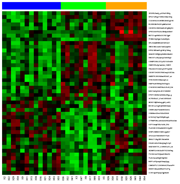
Heatmap shows data expression for each gene (rows) and each sample (columns) between a range of colors that's moves from green to red (lowest expression --> highest expression). Samples are presented in clusters, the row on the top of the heatmap represents each sample group in a different color. In the right figure there are three different groups (blue, green, orange). Expression values are given to a reference gene (ΔCT) or to a reference gene and sample (ΔΔCT). So, black points in the plot indicates that reference value and target gene show the same expression value (there aren't differences), however, if target gene expression is highest to reference value point becomes red and in oposite case, point becomes green. 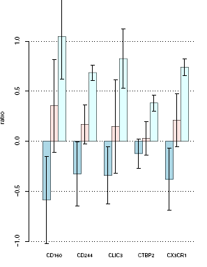
Barplot is presented only for genes who has a significant differential gene expression, normaly genes with a p-value <= 0,05.
In the plot the vertical axis represents the ratio (relative gene expression value), and the horitzontal axis shows the cluster of samples for each gene. So, the right figure shows 5 significant genes with the ratio value of each group in the study. Bar height shows relative gene expression mean for each group and vertical black lines shows standard desviation of data. 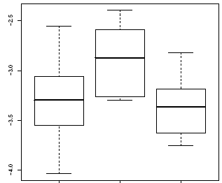
Like barplot, boxplot is presented olny for genes who has a significant differential gene expression.
Each plot corresponds to an unique gene, and each box to a group of samples. Right figure corresponds to a plot of a specific gene with three different classes, defined in the horitzontal axis. Vertical axis shows the ratio (relative gene expression); the box middle represents the mean and the box extremes the standrad desviation, finally the points out of box are extreme values or outliers. |
||